library(tidyverse)

statsci <- read_csv("data/statsci.csv")AE 05: Pivoting StatSci Majors
Suggested answers
Application exercise
Answers
Goal
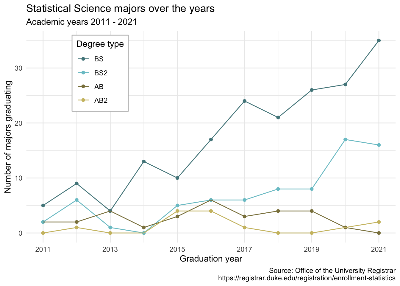
Our ultimate goal in this application exercise is to make the following data visualization.
- Your turn (3 minutes): Take a close look at the plot and describe what it shows in 2-3 sentences.
Add your response here.
Data
The data come from the Office of the University Registrar. They make the data available as a table that you can download as a PDF, but I’ve put the data exported in a CSV file for you. Let’s load that in.
And let’s take a look at the data.
statsci# A tibble: 4 × 12
degree `2011` `2012` `2013` `2014` `2015` `2016` `2017` `2018` `2019` `2020`
<chr> <dbl> <dbl> <dbl> <dbl> <dbl> <dbl> <dbl> <dbl> <dbl> <dbl>
1 Statist… NA 1 NA NA 4 4 1 NA NA 1
2 Statist… 2 2 4 1 3 6 3 4 4 1
3 Statist… 2 6 1 NA 5 6 6 8 8 17
4 Statist… 5 9 4 13 10 17 24 21 26 27
# … with 1 more variable: `2021` <dbl>The dataset has 4 rows and 12 columns. The first column (variable) is the degree, and there are 4 possible degrees: BS (Bachelor of Science), BS2 (Bachelor of Science, 2nd major), AB (Bachelor of Arts), AB2 (Bachelor of Arts, 2nd major). The remaining columns show the number of students graduating with that major in a given academic year from 2011 to 2021.
- Your turn (4 minutes): Take a look at the plot we aim to make and sketch the data frame we need to make the plot. Determine what each row and each column of the data frame should be. Hint: We need data to be in columns to map to
aesthetic elements of the plot.Columns:
year,n,degree_typeRows: Combination of year and degree type
Pivoting
- Demo: Pivot the
statscidata frame longer such that each row represents a degree type / year combination andyearandnumber of graduates for that year are columns in the data frame.
statsci |>
  pivot_longer(
    cols = -degree,
    names_to = "year",
    values_to = "n"
  )
# A tibble: 44 × 3
degree year n
<chr> <chr> <dbl>
1 Statistical Science (AB2) 2011 NA
2 Statistical Science (AB2) 2012 1
3 Statistical Science (AB2) 2013 NA
4 Statistical Science (AB2) 2014 NA
5 Statistical Science (AB2) 2015 4
6 Statistical Science (AB2) 2016 4
7 Statistical Science (AB2) 2017 1
8 Statistical Science (AB2) 2018 NA
9 Statistical Science (AB2) 2019 NA
10 Statistical Science (AB2) 2020 1
# … with 34 more rows- Question: What is the type of the
yearvariable? Why? What should it be?
It’s a character (chr) variable since the information came from the columns of the original data frame and R cannot know that these character strings represent years. The variable type should be numeric.
- Demo: Start over with pivoting, and this time also make sure
yearis a numerical variable in the resulting data frame.
statsci |>
  pivot_longer(
    cols = -degree,
    names_to = "year",
    names_transform = as.numeric,
    values_to = "n"
  )
# A tibble: 44 × 3
degree year n
<chr> <dbl> <dbl>
1 Statistical Science (AB2) 2011 NA
2 Statistical Science (AB2) 2012 1
3 Statistical Science (AB2) 2013 NA
4 Statistical Science (AB2) 2014 NA
5 Statistical Science (AB2) 2015 4
6 Statistical Science (AB2) 2016 4
7 Statistical Science (AB2) 2017 1
8 Statistical Science (AB2) 2018 NA
9 Statistical Science (AB2) 2019 NA
10 Statistical Science (AB2) 2020 1
# … with 34 more rows- Question: What does an
NAmean in this context? Hint: The data come from the university registrar, and they have records on every single graduates, there shouldn’t be anything “unknown” to them about who graduated when.
NAs should actually be 0s.
- Demo: Add on to your pipeline that you started with pivoting and convert
NAs innto0s.
statsci |>
  pivot_longer(
    cols = -degree,
    names_to = "year",
    names_transform = as.numeric,
    values_to = "n"
  ) |>
  mutate(n = if_else(is.na(n), 0, n))
# A tibble: 44 × 3
degree year n
<chr> <dbl> <dbl>
1 Statistical Science (AB2) 2011 0
2 Statistical Science (AB2) 2012 1
3 Statistical Science (AB2) 2013 0
4 Statistical Science (AB2) 2014 0
5 Statistical Science (AB2) 2015 4
6 Statistical Science (AB2) 2016 4
7 Statistical Science (AB2) 2017 1
8 Statistical Science (AB2) 2018 0
9 Statistical Science (AB2) 2019 0
10 Statistical Science (AB2) 2020 1
# … with 34 more rows- Demo: In our plot the degree types are BS, BS2, AB, and AB2. This information is in our dataset, in the
degreecolumn, but this column also has additional characters we don’t need. Create a new column calleddegree_typewith levels BS, BS2, AB, and AB2 (in this order) based ondegree. Do this by adding on to your pipeline from earlier.
statsci |>
  pivot_longer(
    cols = -degree,
    names_to = "year",
    names_transform = as.numeric,
    values_to = "n"
  ) |>
  mutate(n = if_else(is.na(n), 0, n)) |>
  separate(degree, sep = " \\(", into = c("major", "degree_type")) |>
  mutate(
    degree_type = str_remove(degree_type, "\\)"),
    degree_type = fct_relevel(degree_type, "BS", "BS2", "AB", "AB2")
    )
# A tibble: 44 × 4
major degree_type year n
<chr> <fct> <dbl> <dbl>
1 Statistical Science AB2 2011 0
2 Statistical Science AB2 2012 1
3 Statistical Science AB2 2013 0
4 Statistical Science AB2 2014 0
5 Statistical Science AB2 2015 4
6 Statistical Science AB2 2016 4
7 Statistical Science AB2 2017 1
8 Statistical Science AB2 2018 0
9 Statistical Science AB2 2019 0
10 Statistical Science AB2 2020 1
# … with 34 more rows- Your turn (5 minutes): Now we start making our plot, but let’s not get too fancy right away. Create the following plot, which will serve as the “first draft” on the way to our Goal. Do this by adding on to your pipeline from earlier.
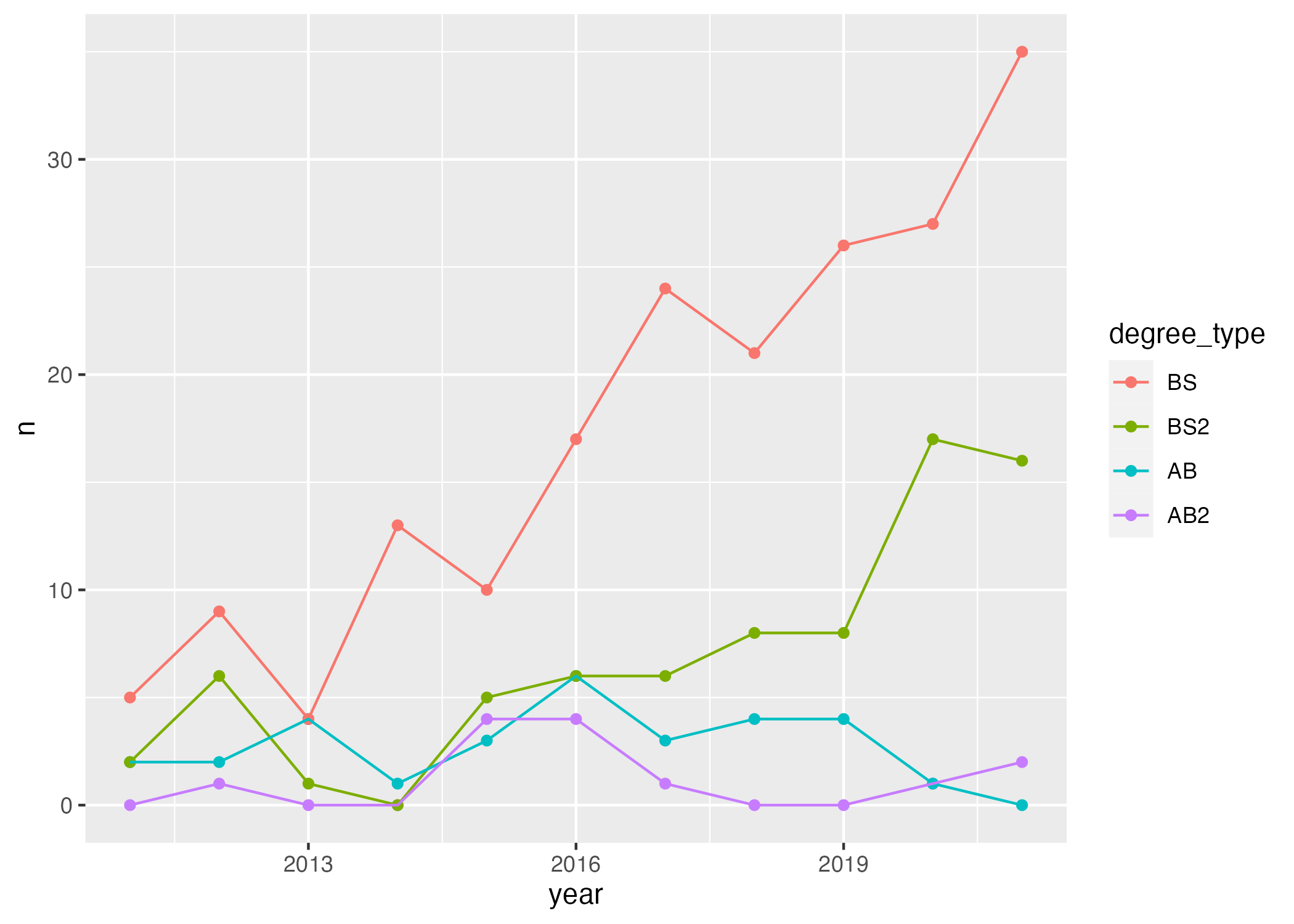
statsci |>
  pivot_longer(
    cols = -degree,
    names_to = "year",
    names_transform = as.numeric,
    values_to = "n"
  ) |>
  mutate(n = if_else(is.na(n), 0, n)) |>
  separate(degree, sep = " \\(", into = c("major", "degree_type")) |>
  mutate(
    degree_type = str_remove(degree_type, "\\)"),
    degree_type = fct_relevel(degree_type, "BS", "BS2", "AB", "AB2")
    ) |>
  ggplot(aes(x = year, y = n, color = degree_type)) +
  geom_point() +
  geom_line()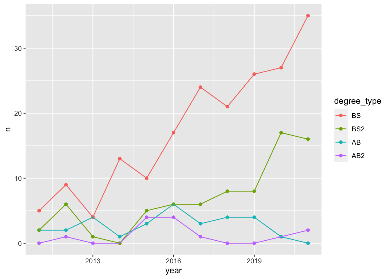
- Your turn (4 minutes): What aspects of the plot need to be updated to go from the draft you created above to the Goal plot at the beginning of this application exercise.
x-axis scale: need to go from 2011 to 2021 in increments of 2 years
line colors
axis labels: title, subtitle, x, y, caption
theme
legend position and border
- Demo: Update x-axis scale such that the years displayed go from 2011 to 2021 in increments of 2 years. Do this by adding on to your pipeline from earlier.
statsci |>
  pivot_longer(
    cols = -degree,
    names_to = "year",
    names_transform = as.numeric,
    values_to = "n"
  ) |>
  mutate(n = if_else(is.na(n), 0, n)) |>
  separate(degree, sep = " \\(", into = c("major", "degree_type")) |>
  mutate(
    degree_type = str_remove(degree_type, "\\)"),
    degree_type = fct_relevel(degree_type, "BS", "BS2", "AB", "AB2")
    ) |>
  ggplot(aes(x = year, y = n, color = degree_type)) +
  geom_point() +
  geom_line() +
  scale_x_continuous(breaks = seq(2011, 2021, 2))
- Demo: Update line colors using the following level / color assignments. Once again, do this by adding on to your pipeline from earlier.
“BS” = “cadetblue4”
“BS2” = “cadetblue3”
“AB” = “lightgoldenrod4”
“AB2” = “lightgoldenrod3”
statsci |>
  pivot_longer(
    cols = -degree,
    names_to = "year",
    names_transform = as.numeric,
    values_to = "n"
  ) |>
  mutate(n = if_else(is.na(n), 0, n)) |>
  separate(degree, sep = " \\(", into = c("major", "degree_type")) |>
  mutate(
    degree_type = str_remove(degree_type, "\\)"),
    degree_type = fct_relevel(degree_type, "BS", "BS2", "AB", "AB2")
    ) |>
  ggplot(aes(x = year, y = n, color = degree_type)) +
  geom_point() +
  geom_line() +
  scale_x_continuous(breaks = seq(2011, 2021, 2)) +
  scale_color_manual(
    values = c("BS" = "cadetblue4",
               "BS2" = "cadetblue3",
               "AB" = "lightgoldenrod4",
               "AB2" = "lightgoldenrod3"))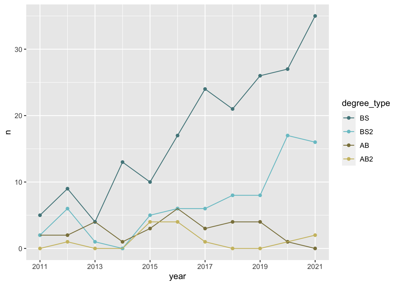
- Your turn (4 minutes): Update the plot labels (
title,subtitle,x,y, andcaption) and usetheme_minimal(). Once again, do this by adding on to your pipeline from earlier.
statsci |>
  pivot_longer(
    cols = -degree,
    names_to = "year",
    names_transform = as.numeric,
    values_to = "n"
  ) |>
  mutate(n = if_else(is.na(n), 0, n)) |>
  separate(degree, sep = " \\(", into = c("major", "degree_type")) |>
  mutate(
    degree_type = str_remove(degree_type, "\\)"),
    degree_type = fct_relevel(degree_type, "BS", "BS2", "AB", "AB2")
    ) |>
  ggplot(aes(x = year, y = n, color = degree_type)) +
  geom_point() +
  geom_line() +
  scale_x_continuous(breaks = seq(2011, 2021, 2)) +
  scale_color_manual(
    values = c("BS" = "cadetblue4",
               "BS2" = "cadetblue3",
               "AB" = "lightgoldenrod4",
               "AB2" = "lightgoldenrod3")) +
  labs(
    x = "Graduation year",
    y = "Number of majors graduating",
    color = "Degree type",
    title = "Statistical Science majors over the years",
    subtitle = "Academic years 2011 - 2021",
    caption = "Source: Office of the University Registrar\nhttps://registrar.duke.edu/registration/enrollment-statistics"
  ) +
  theme_minimal()
- Demo: Finally, adding to your pipeline you’ve developed so far, move the legend into the plot, make its background white, and its border gray. Set
fig-width: 7andfig-height: 5for your plot in the chunk options.
statsci |>
  pivot_longer(
    cols = -degree,
    names_to = "year",
    names_transform = as.numeric,
    values_to = "n"
  ) |>
  mutate(n = if_else(is.na(n), 0, n)) |>
  separate(degree, sep = " \\(", into = c("major", "degree_type")) |>
  mutate(
    degree_type = str_remove(degree_type, "\\)"),
    degree_type = fct_relevel(degree_type, "BS", "BS2", "AB", "AB2")
    ) |>
  ggplot(aes(x = year, y = n, color = degree_type)) +
  geom_point() +
  geom_line() +
  scale_x_continuous(breaks = seq(2011, 2021, 2)) +
  scale_color_manual(
    values = c("BS" = "cadetblue4",
               "BS2" = "cadetblue3",
               "AB" = "lightgoldenrod4",
               "AB2" = "lightgoldenrod3")) +
  labs(
    x = "Graduation year",
    y = "Number of majors graduating",
    color = "Degree type",
    title = "Statistical Science majors over the years",
    subtitle = "Academic years 2011 - 2021",
    caption = "Source: Office of the University Registrar\nhttps://registrar.duke.edu/registration/enrollment-statistics"
  ) +
  theme_minimal() +
  theme(
    legend.position = c(0.2, 0.8),
    legend.background = element_rect(fill = "white", color = "gray")
    )