library(tidyverse)
library(lubridate)Yankee Candle reviews on Amazon
Suggested answers
Application exercise
Answers
Part 1 - Data scraping
See yankee-candle-scrape-A.R for suggested scraping code.
Part 2 - Data analysis
Let’s start by loading the packages we will need:
- Load the data you saved into the
datafolder and name ityc_reviews_all.
yc_reviews_all <- read_csv("data/yc-reviews-all.csv")- Your turn (5 minutes): Our goal is to plot the number of reviews or titles mentioning “no scent” or “no smell” per week. Take a look at the data you loaded and outline how you can transform it to prepare it for such a plot. Your response should be bullet points that can roughly be translated to steps in a data wrangling pipeline.
- Extract date of review.
- Figure out which week of the year the date corresponds to.
- Look for “no scent” or “no smell” in the titles or reviews.
- Count how many titles or reviews have these phrases mentioned for each week.
- Plot the number of mentions by week against week number.
- Demo: Create the plot described above.
yc_reviews_all |>
  mutate(
    date = mdy(country_date),
    week = week(date),
    review = str_to_lower(review),
    title = str_to_lower(title),
    no_scent = case_when(
      str_detect(review, "no scent") | str_detect(title, "no scent") ~ "mentioned",
      str_detect(review, "no smell") | str_detect(title, "no smell") ~ "mentioned",
      TRUE ~ "not mentioned"
    )
  ) |>
  count(week, no_scent) |>
  filter(no_scent == "mentioned") |>
  ggplot(aes(x = week, y = n, group = 1)) +
  geom_line()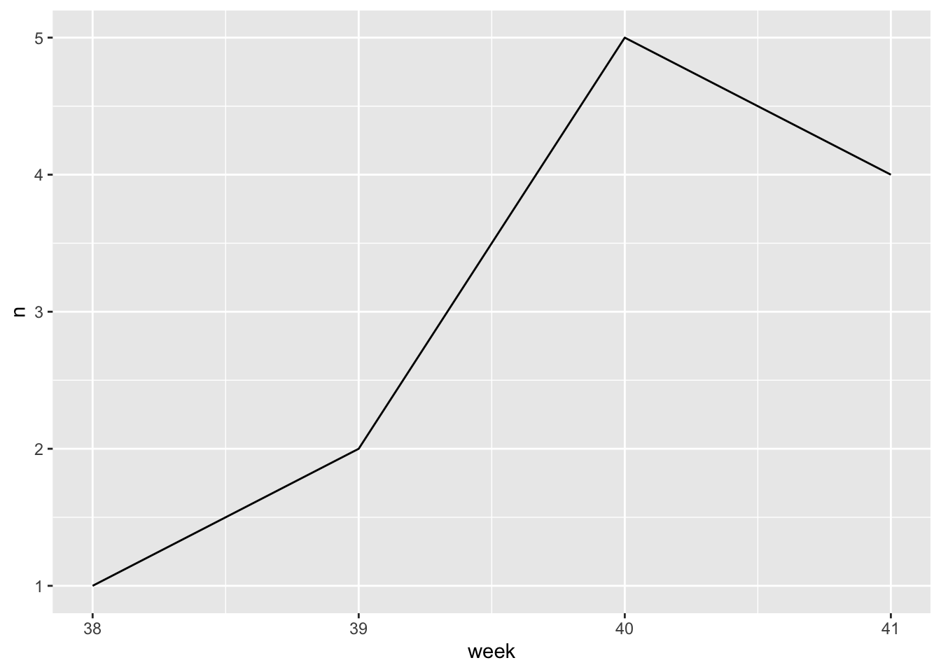
- Your turn (3 minutes): Outline how this exercise could be expanded to make a plot like this one that compares number of reviews mentioning no scent/smell and number of COVID cases.
Scrape data going further back and join it with weekly COVID cases data from another source and plot both.