Exam 1 Review
Lecture 10
9/29/22
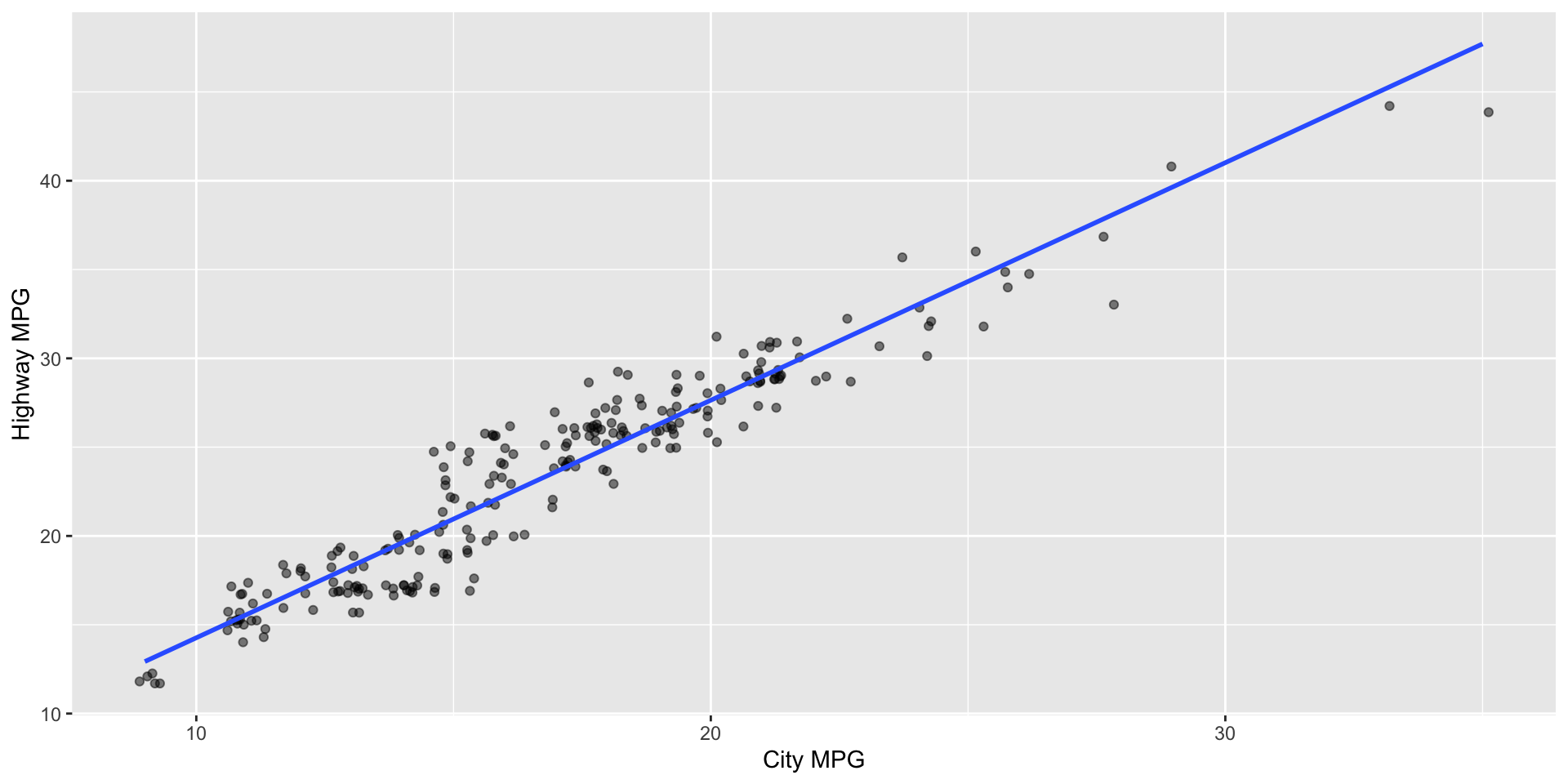
Interpreting data visualizations I
Provide a 1-2 sentence interpretation of the relationship between city and highway mileage of cars.
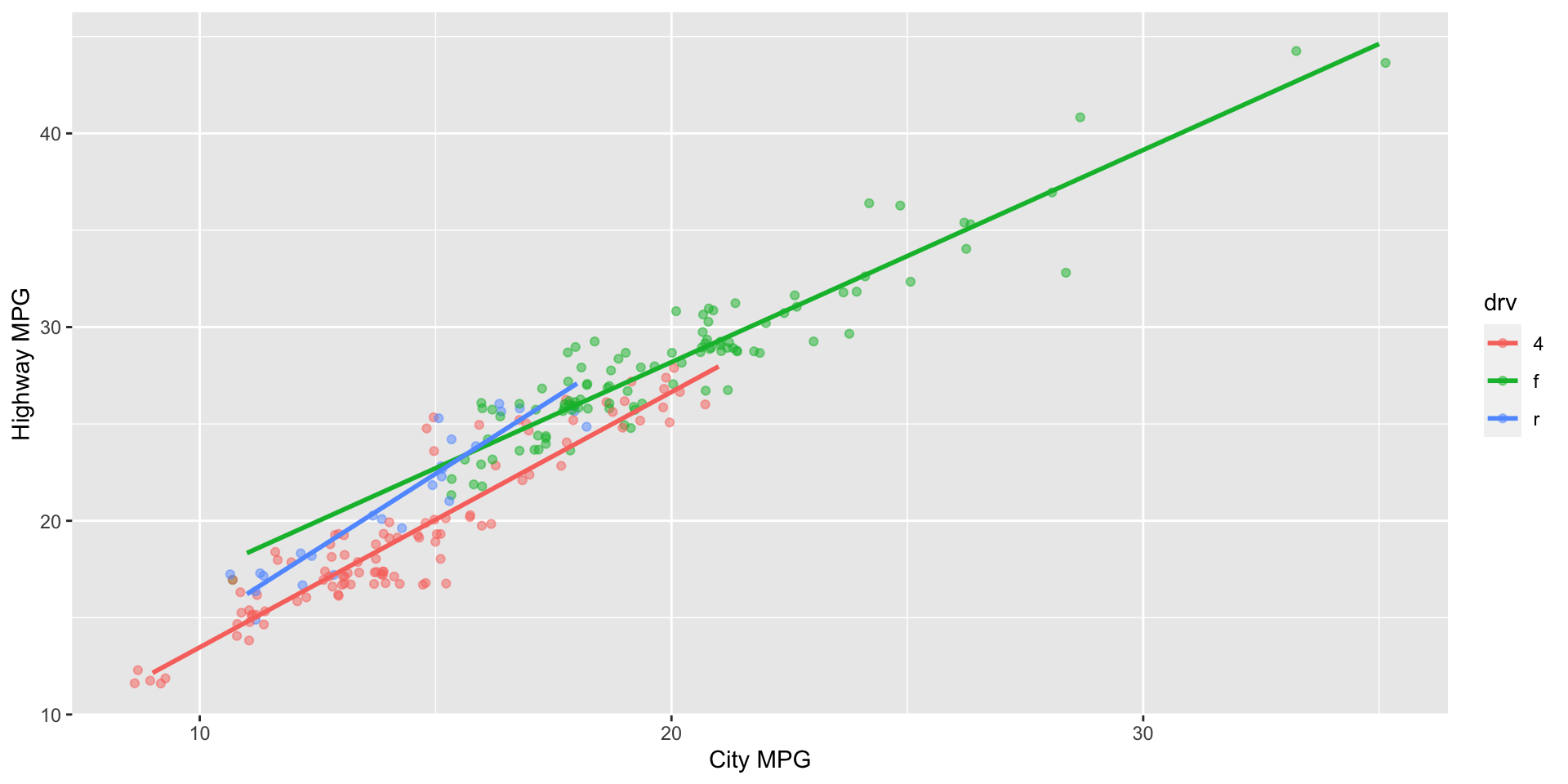
Interpreting data visualizations II
Provide a 1-2 sentence interpretation of the relationship between city and highway mileage of cars, taking into consideration whether they’re 4 wheel drive, front wheel drive, or rear wheel drive.
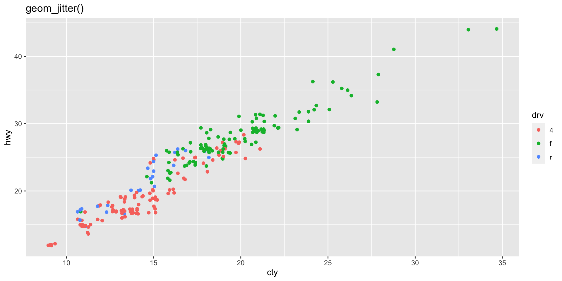
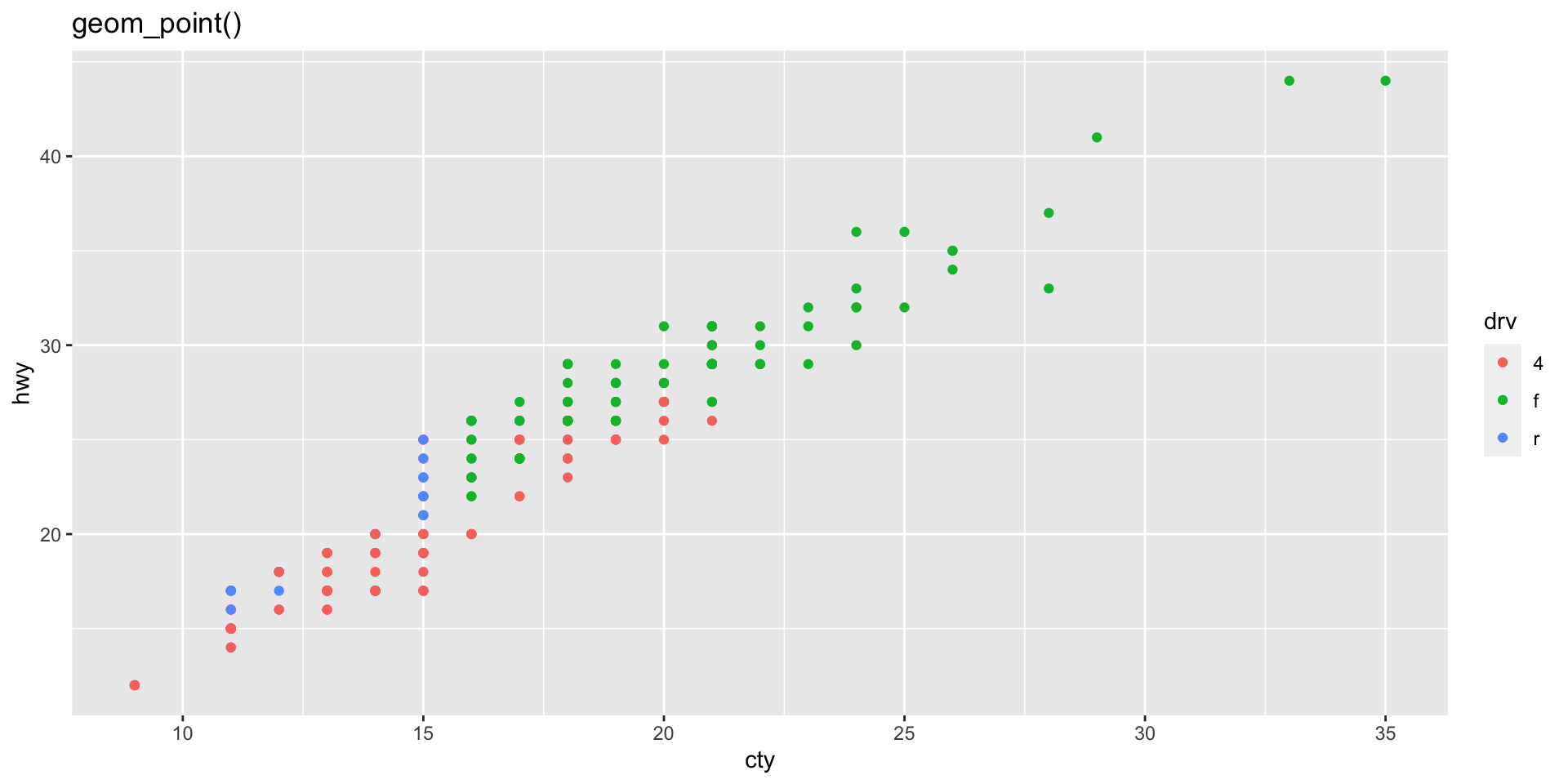
geom_jitter() vs. geom_point()
The same dataset is plotted with geom_jitter() and geom_point() below. Why do the two plots look different?
Working with categorical data
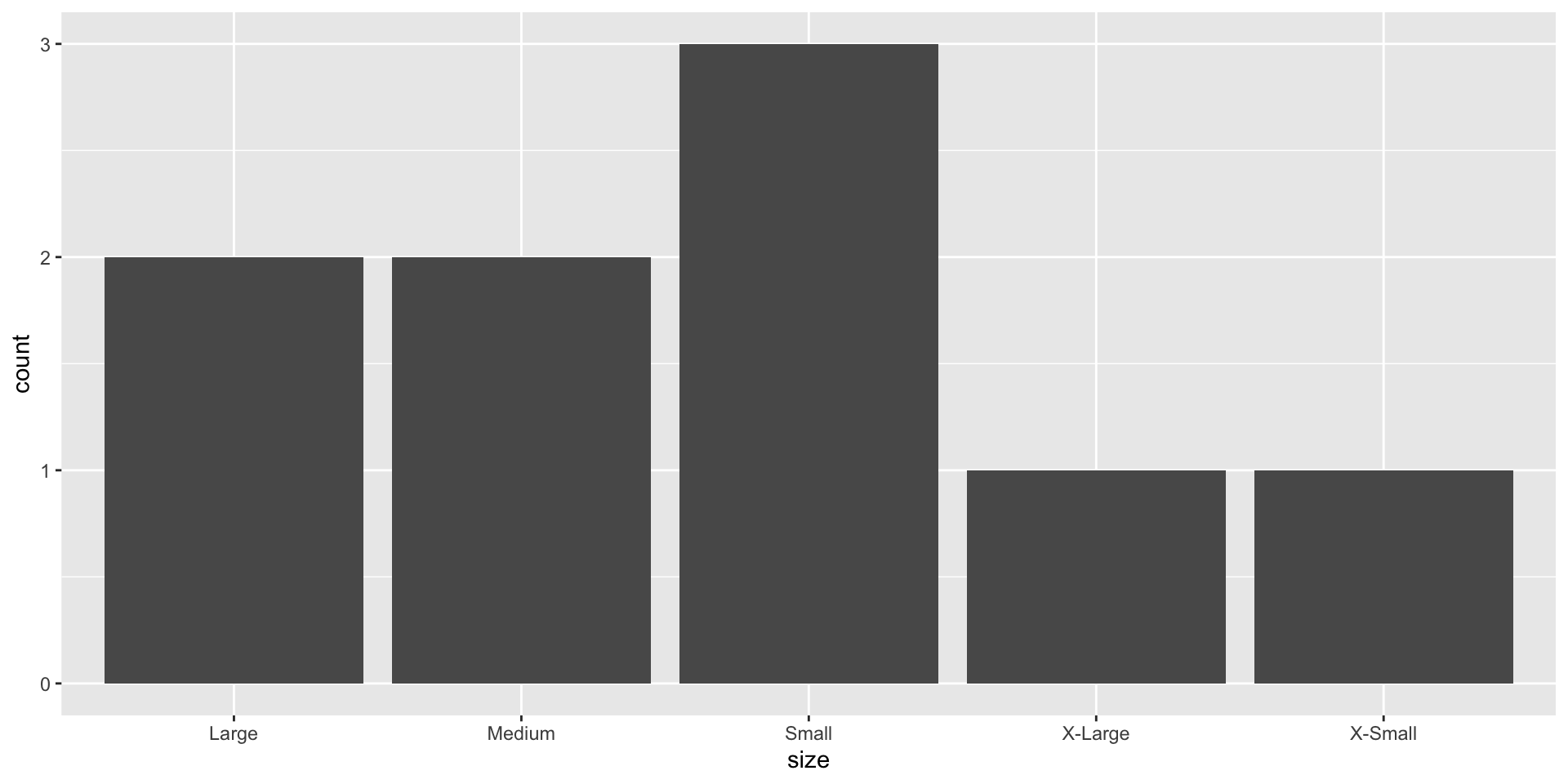
fct_relevel()
Reorder levels based on an order you provide
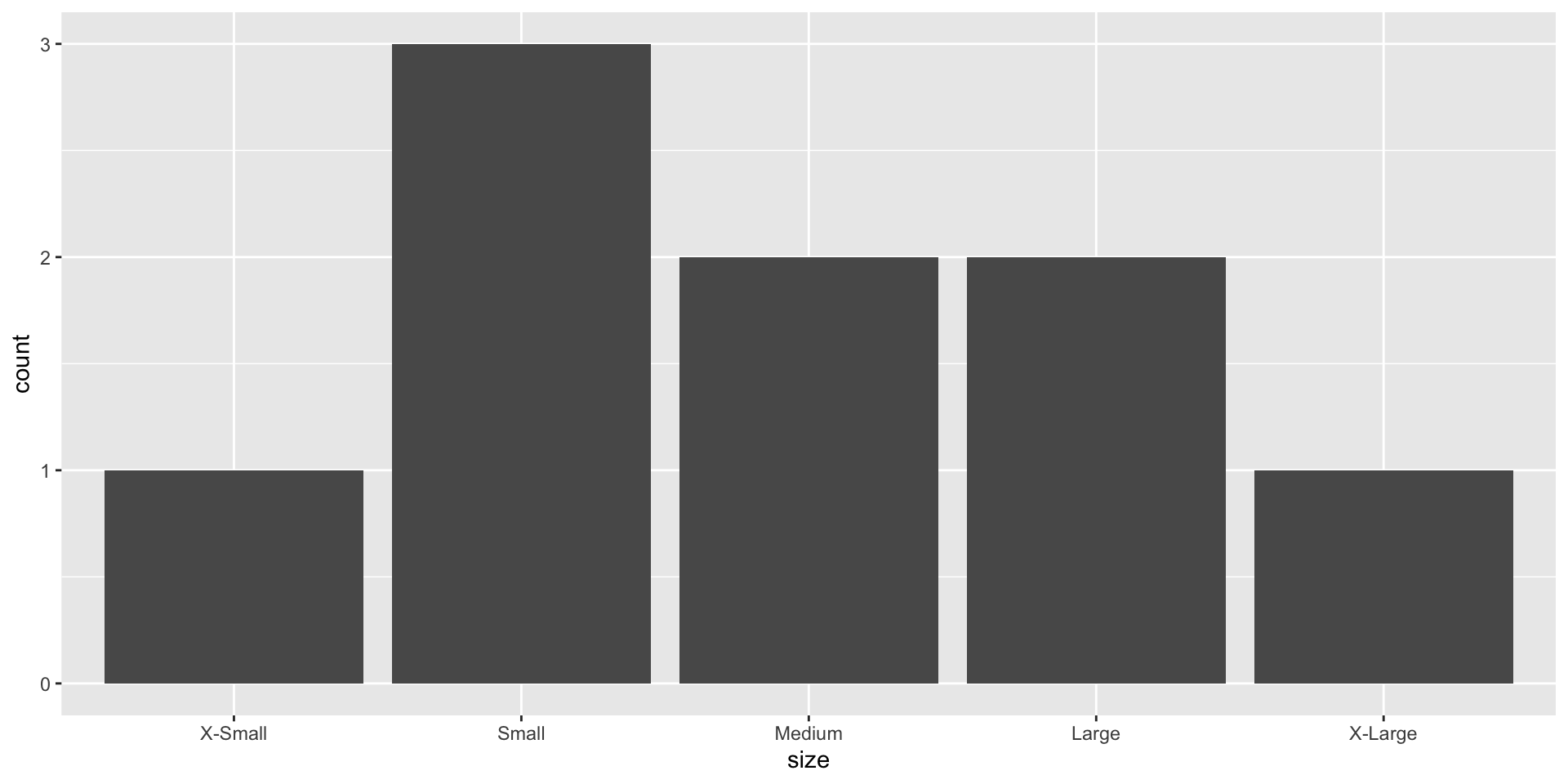
fct_reorder()
Reorder levels based on another variable
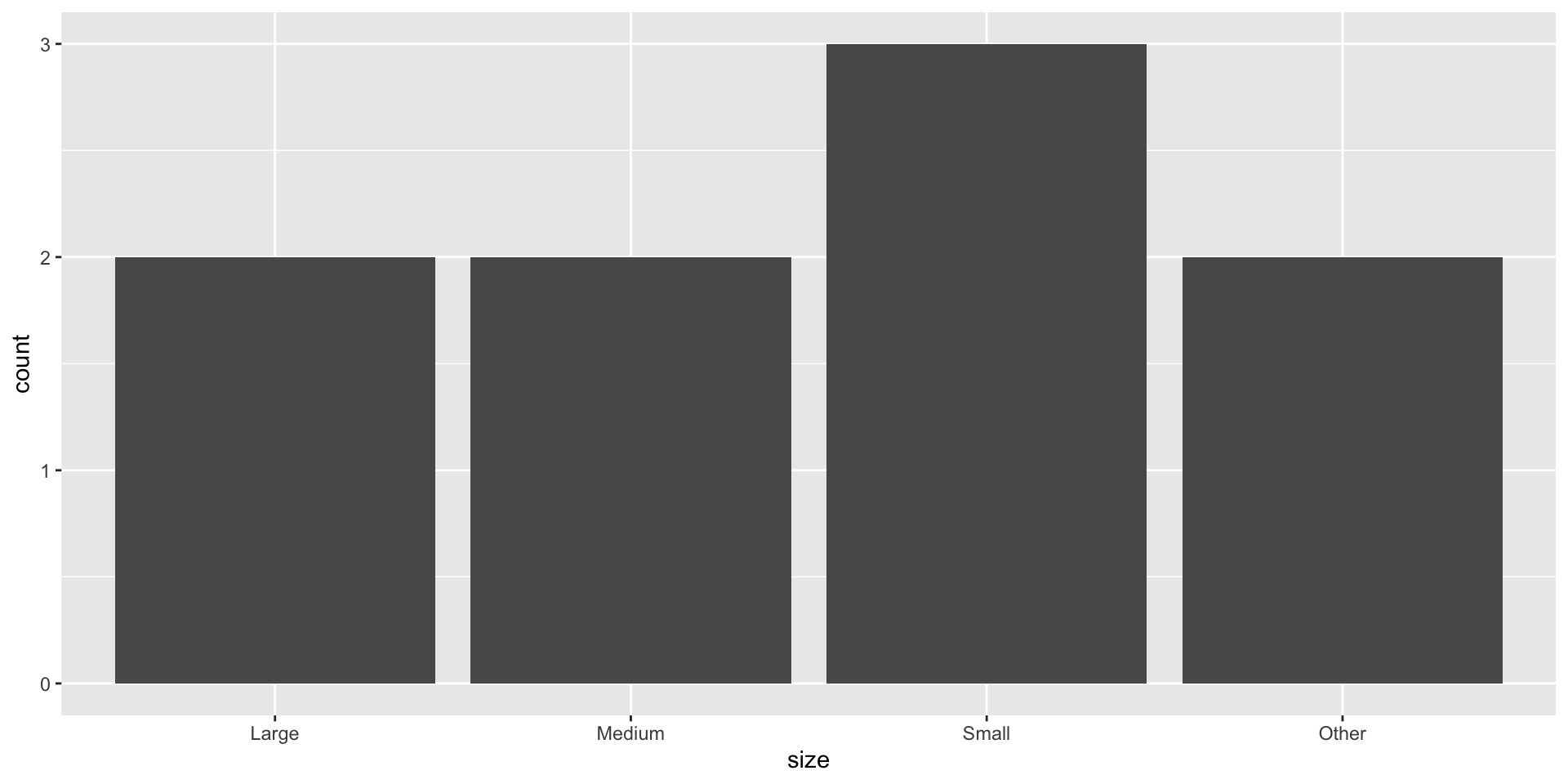
fct_other()
Lump some levels to “Other”
Pivoting and joining
Let’s visit https://www.garrickadenbuie.com/project/tidyexplain!